Become A Better Graphic Designer by Thinking Like a Sign-Painter
4 Ways I've Made My Designs Better by Thinking Like a Sign-Painter

I’m heading into week 6 of 8 of my sign-painting course, and I’m excited to share the thoughts and lessons from this journey once I’m done. But for now, one of the main things I keep thinking about is “wow, I wish I had learned these design fundamentals in college,” and two, I’m realizing that my reverence for vintage signs comes from the fact that the sign painters back in the day took the time to make sure every letter was purposeful and interesting. They had to! It was one of the only ways to advertise a message, and the messaging had to be planned before they put a brush to a board. I am inspired and keep thinking the phrase “we can be better designers…we can be better designers.” I think it’s good to sometimes kick ourselves in the tail a bit like this, so we don’t become stagnant and accidentally make mediocre work when it could have been great.
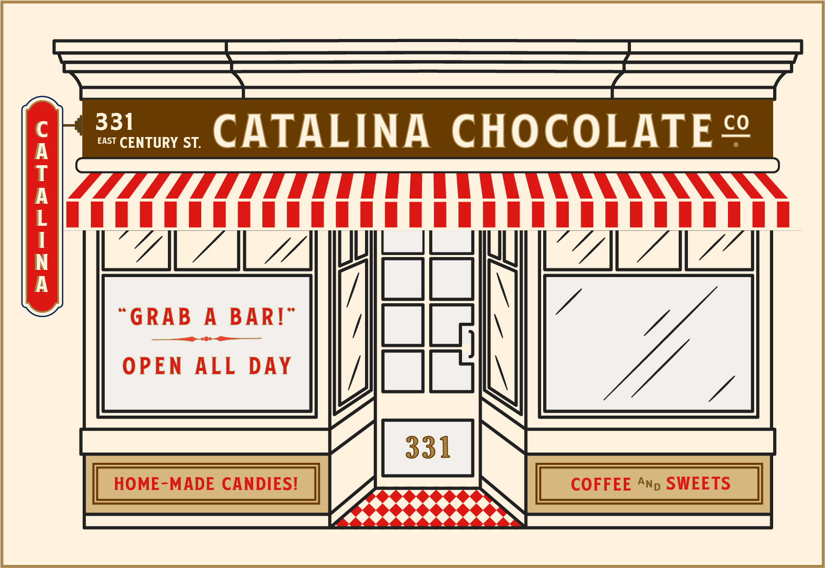
Last year, I chatted a lot in this space about a doughnut company I had the opportunity to rebrand in a 1930s industrial design style. Dream job! Well, I did the work, and then the company got new leadership and went in another direction that feels like 2014 instead of 1930. Big difference! These things happen, and they were nice (like how I threw that in there after giving 2014 shade? I’m sorry.) Part of what made that project so great is that they gave me full control to go as detailed as I wanted. So, instead of housing the work on a hard drive to die a sad death, I’m repurposing it into a Chocolate Brand.
Today, I want to share some examples of the exterior signage work I created and pretend that we have to present our work to a master sign painter from 1930, who will judge us on whether we’ve pushed ourselves to create the most interesting and purposeful version of the design we possibly can.
Starting with, let’s play a “spot the difference” game! *Tip. There are 4 differences.
Exterior Signage | Version 01