


Designing The Wes Anderson Archive
Part 01: All Things Working Together

When I told a friend that I was working on the Wes Anderson Archive design for the Criterion Collection, her response was, “This has been the most incredible long game.” And she was right. Like so many of us, I’ve found Wes Anderson’s films to be a massive source of inspiration. The color palettes, characters, set design, soundtracks, and the storylines all create formative memories in my mind.
I vividly remember the first time I saw The Royal Tenenbaums. That bright red paired with pink blew open my world and made me think differently about color combinations. Moonrise Kingdom reinvigorated my deep love for all things “camp.”
But most of all, I’m inspired by Wes Anderson’s ability to tell stories through world-building and his (and his team’s) attention to the tiniest details, which make every part of these films feel intentional and meaningful.
Over a Decade Ago…
Back in 2012, I used to design color palettes based on films I loved. It all started because of Wes Anderson’s films. I created palettes for Rushmore, Moonrise Kingdom, and The Grand Budapest Hotel. I put them on my website, and, as things go, I eventually forgot about them. They ended up buried somewhere deep within my site and Google’s image search.

Six Years Ago…
After moving to Los Angeles, I became interested in graphic prop design for films. I started creating self-imposed graphic prop projects as a way to tell stories about my small hometown, odd situations I found myself in, and family memories. It became an amazing creative outlet outside of my day job, and it was during that time that I started to become fixated on the details in design work.
I had become enamored with Annie Atkins’ design work and signed up for her prop design workshop in Dublin, Ireland. (Actually, when I signed up, the workshop was full, but she let me slip in! Thank you, Annie!). That weekend was the catalyst I needed to start dreaming about going out on my own and creating work that felt energizing and true to how I love to design: through the lens of storytelling.

Last Fall…
Last September, my husband Dan and I found ourselves in New York City a bit on a whim, visiting friends and walking miles upon miles as one does. What a dream city for such an activity. We stopped in Central Park for a break, and I saw the email come in from Criterion Collection’s amazing art director, Eric Skillman.

Dan quickly searched Criterion’s address and can you believe this? The Criterion Collection is based in New York, which meant I could head to their office the very next day and have a meeting about the project.
September 13, 2024…
I took the elevator up to the Criterion floor and stepped out into an office full of film posters and Blu-rays. (For you film people, I’d like you to know that I kept calling them DVDs throughout the meeting. A Cardinal sin.). I met with Eric, and we discussed the details of the first phase of the project: box set concepts. It was then that I learned he had found my name through the Wes Anderson color palettes on my website. The ones I forgot about. If my head could have spun around 360 degrees, it would have.
We talked about design specs, he showed me examples of other Criterion releases, and I asked the question, “So how does this work? Who is the creative director, and who signs off on approvals?” The answer was Wes.
I was then shown the infamous Criterion Closet. The first thing I noticed in the closet was the hit La Bamba. My family loved La Bamba growing up, and I then proceeded to tell the story of how I met Lou Diamond Phillips (Richie Valens) in a Cracker Barrel in Mt. Vernon, Illinois when I was four years old. Classic.
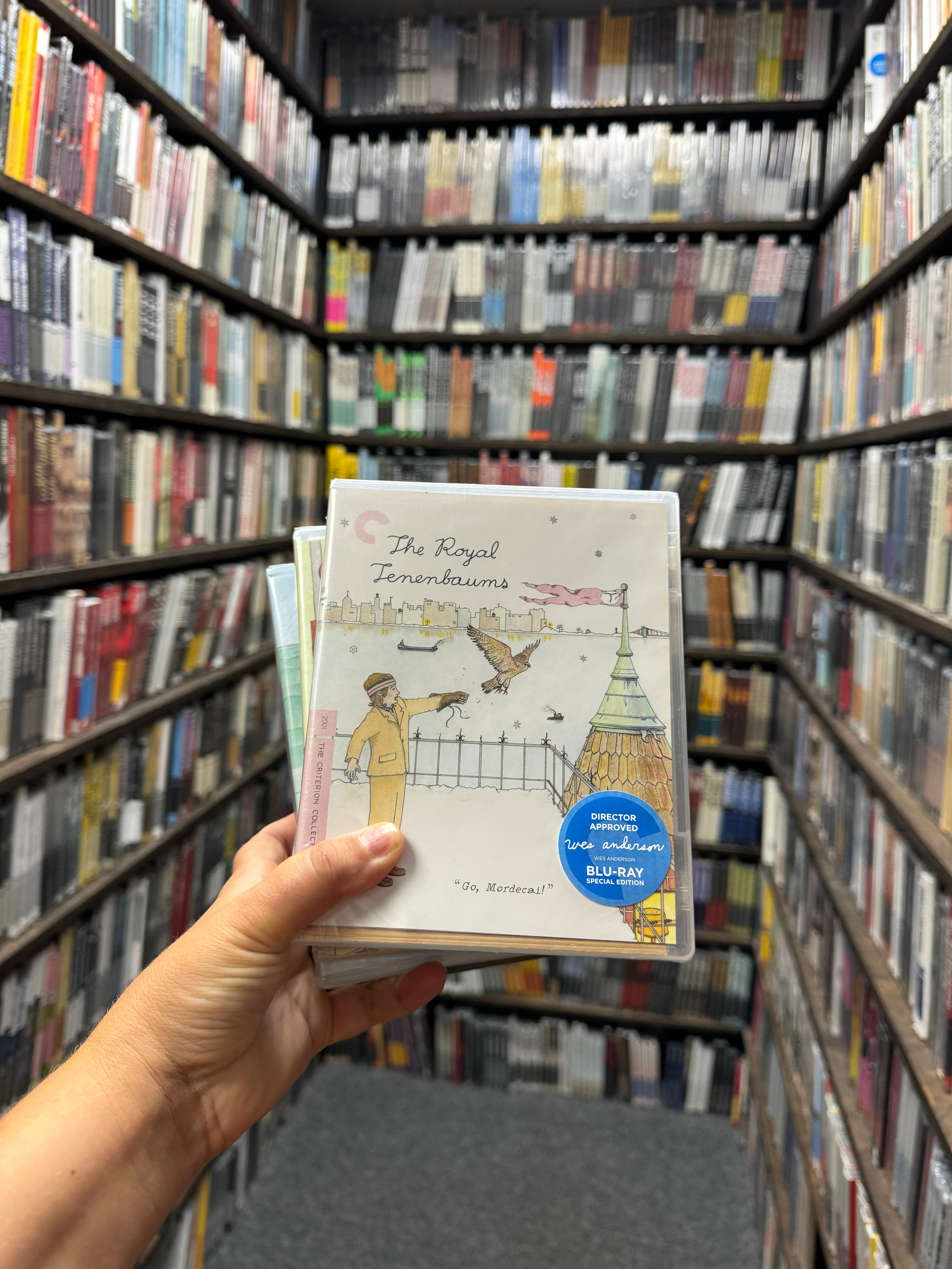
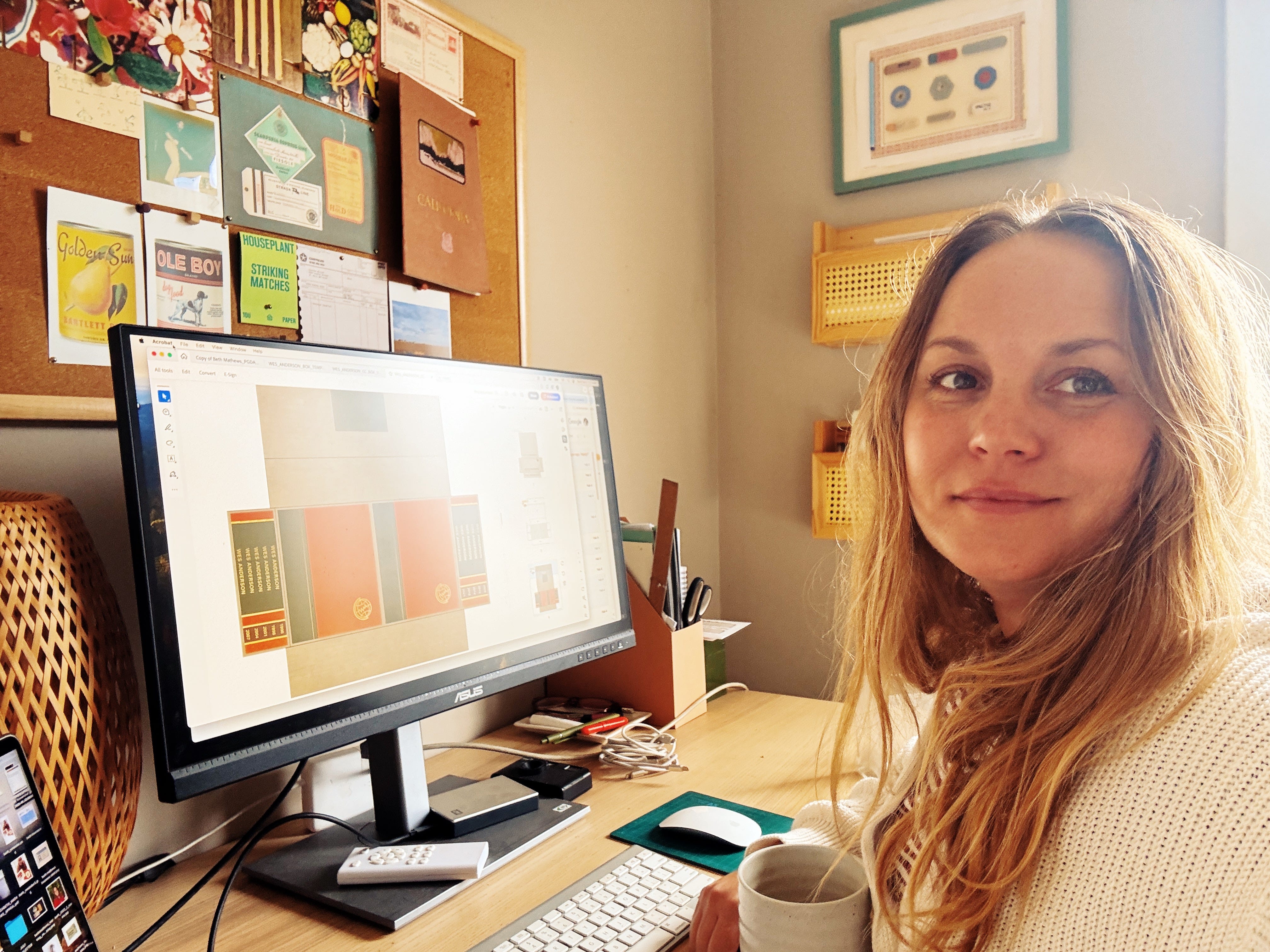
I was given a stack of Wes Anderson’s films, we shook hands about the project, and I was on my way to start the box set design concepts …
Following Curiosities
I recently did the math, and I’ve been in the graphic design business for 18 years now. My path has taken me through roles at an agency, a record label, and a giant tech company as a designer, as well as serving as a creative director at a nonprofit, working as an art director at a plant milk company, and freelancing during various stretches of this ride.
In my free time, I dive through estate sales looking for unique pieces of ephemera, create fake brands inspired by people I’ve met, love to visit archives in Los Angeles and share what I’ve discovered, and constantly take photos of signage, buildings, tile work, and plants.
All the while, I’ve been really lucky to have had the time and space to follow creative curiosities and act on those moments when inspiration strikes. I’m genuinely awestruck by how things have connected. If I hadn’t been inspired by Wes Anderson’s films, I never would have created those color palettes 12 years ago. And if I hadn’t followed the curious path of prop designing, flown to Dublin for the props workshop, and built a personal library of graphic props for my own enjoyment, I wouldn’t have been able to show I was capable of designing a box set for Wes Anderson and the Criterion Collection.
So when I got the direction from Wes to “make this look like a 1970s encyclopedia set from an estate sale,” I felt confident and excited. I had been training for this my whole life.
More to Come
I’m looking forward to discussing the more technical aspects of this project: the patterns, the logo, and the interior books (!).
I also went deep on encyclopedia design history. Here are some things I learned:
It took 14 years to do a rebrand of the The World Book Encyclopedia that launched in 1988. 14 YEARS. Bless that team’s nervous system.
World Book commissioned the world‘s foremost type designer, Hermann Zapf, to create an exclusive new typeface. Zapf designed more than 175 typefaces during his career, including the commonly used fonts Palatino, Optima, and ITC Zapf. “The idea was to create a typeface for World Book‘s future publications with a contemporary look, not a warm up of a historic alphabet,” stated Zapf. He was successful in his goal and created the new typeface, World Book Modern.
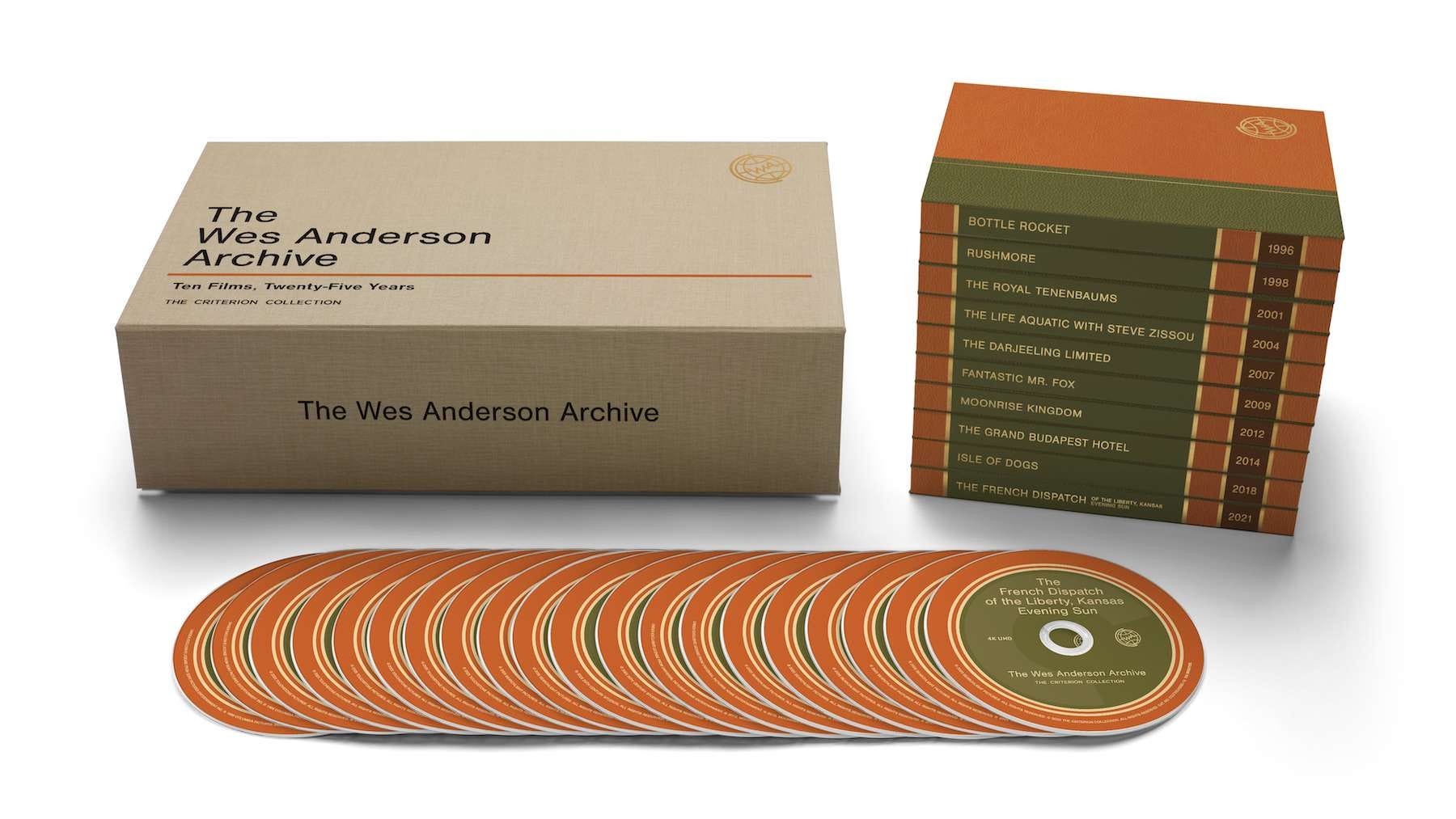
If you’d like to pre-order the box set, you can learn more about it here! It releases in stores and online September 30th!

Quick Fun Things!
HBO has a great 2-part documentary about Pee-wee. Talk about another huge source of inspiration. It was so well done and I wish I could give him a hug.
I’m really late to the band Turnstile but my friends showed me their 11 minute music video last night. It’s just really, really good.
It’s very easy to make your own yogurt if you have an instant pot/air fryer!
Last Note
If you’d like to join in as a paid monthly subscriber ($8/month), I create monthly design prompts, share design tutorials, and walk through projects I’m working on. I know it’s a commitment to support something monthly so I take it seriously and thank those that have joined the club and thank you for being a subscriber to this monthly newsletter!
Have a wonderful June! There’s a lot to be excited about. Swimming, cookouts, lightning bugs!
Love!
Beth
That is such a cool story! Really goes to show that when you put that energy out there, be ready for it to come back to you! Just maybe not when you first expect it.
I remember those!! So thrilled for you. The most perfect project.