

How I Designed a Font Inspired by a Technical Illustrator’s 1959 Schoolwork
A Love Letter to Technical Lettering

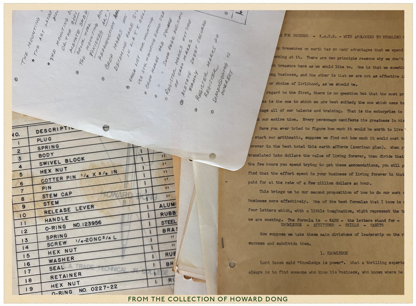
I feel like, at this point, I need to insert a disclaimer at the start of every post that states, “A recent estate sale inspired this post”. This is a story about how I went to an estate sale in Pasadena, CA, of a retired technical illustrator named Howard Dong, and stumbled upon his schoolwork from the Los Angeles Trade Tech College Art Department in the year 1959. Howard’s work sparked the idea for me to create the typeface Parts List, and, like one does, I went down the rabbit hole of technical illustration typeface history.

Hidden within a stack of Howard’s schoolwork stuffed inside a manila folder was a list of mechanical parts that caught my eye. It caught my eye because I had been searching for years for this perfect typeface that’s often seen out in the world on vintage draft plans, oil-stained mechanic lists in a machine shop, and the legend in the corner of maps.
A Brief History of Technical Lettering
Between the 1930s and 1970s, draftspeople, cartographers, and architects used a popular technical lettering device called the Leroy Lettering Set made by Keuffel & Esser, a prominent manufacturer of drafting instruments. The Leroy lettering set provided a method for creating uniform and legible lettering for marking technical drawings, maps, architectural plans, and even comics. Essentially, the Leroy Lettering Set was a set of templates and stencils where, previously, all technical lettering was created freehand.


Let’s Take A Step Back Even Further Now
I find it fascinating that just when I think I’ve found the answer to some design history phenomenon (tech typefaces), we can keep rolling back the layers. Before the “Leroy Lettering Set”, a very similar style of typography could be seen and produced by an engraving machine called the Gorton Engraving Machine. This rotary machine carved letters into a base material like metal, plastic, and wood.

These artifacts surround our daily lives to this day. Do these types of signs feel familiar to you, too?

Creating Parts List
So when I saw Howard’s machine parts list, I knew I had to try to digitize it, as I hadn’t found a typeface that had ever entirely given me the feeling of Gorton and Leroy, which is one that smells like burnt coffee while you’re in an oil changing waiting room, while a soap opera on the TV is blaring in the background and then the mechanic pulls out his pad of paper to ring you up and then hands you a carbon copy receipt. These typefaces represent our daily lives, and I was on a quest to try to recreate it.
Step One:
I scanned Howard’s machine parts list into my computer and opened it up in Adobe Illustrator. I then used the “Image Trace” tool to extract the letters.
The image scan is on the left, and the roughly traced image is on the right. You can also see how I started pulling the letters out of the scan to form an alphabet.

Step Two:
Using the Adobe Illustrator plugin Fontself and its template, I started plugging in the letters to create the Parts List font.

If you’re new to creating a typeface like I was, Fontself is incredibly easy to use. And it’s so much fun! Real type designers might flip their tables over this tool, but it’s a good entryway into this world, I think. (I bow down to your skillset type designer!)
Step Three:
I then tested the font and compared it to the original Leroy Lettering found in Howard’s schoolwork.

I think it’s a pretty close match. If I had to do it over again, I might clean it up just a bit, but I like that the lines are a little wobbly, which again, perhaps brings in that carbon copy feel. If you’d like to take her for a spin, I’m putting “Parts List” on sale this week for $5! Step right up…

Similiar Typefaces
And wouldn’t you know, after doing research for this post, I found a ton of additional typefaces that were inspired by Leroy Lettering.
Dive Even Deeper
If you’d like to dive even deeper into the world of Gorton, Marcin Wichary wrote an incredible piece about its history titled “The Hardest Working Font in Manhattan”. Thank you to designer Kevin Pitts for sharing that with me!
If you enjoyed this and would like to show your support for my work:
Please feel free to share this post with someone who might be interested!
Or perhaps consider becoming a paid subscriber. Many thanks in advance.
See you around these parts (list) soon!
Love,
Beth
YES
This is the content I seek
I love the story behind this! I need to find cooler estate sales I think 🤣