

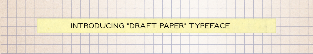
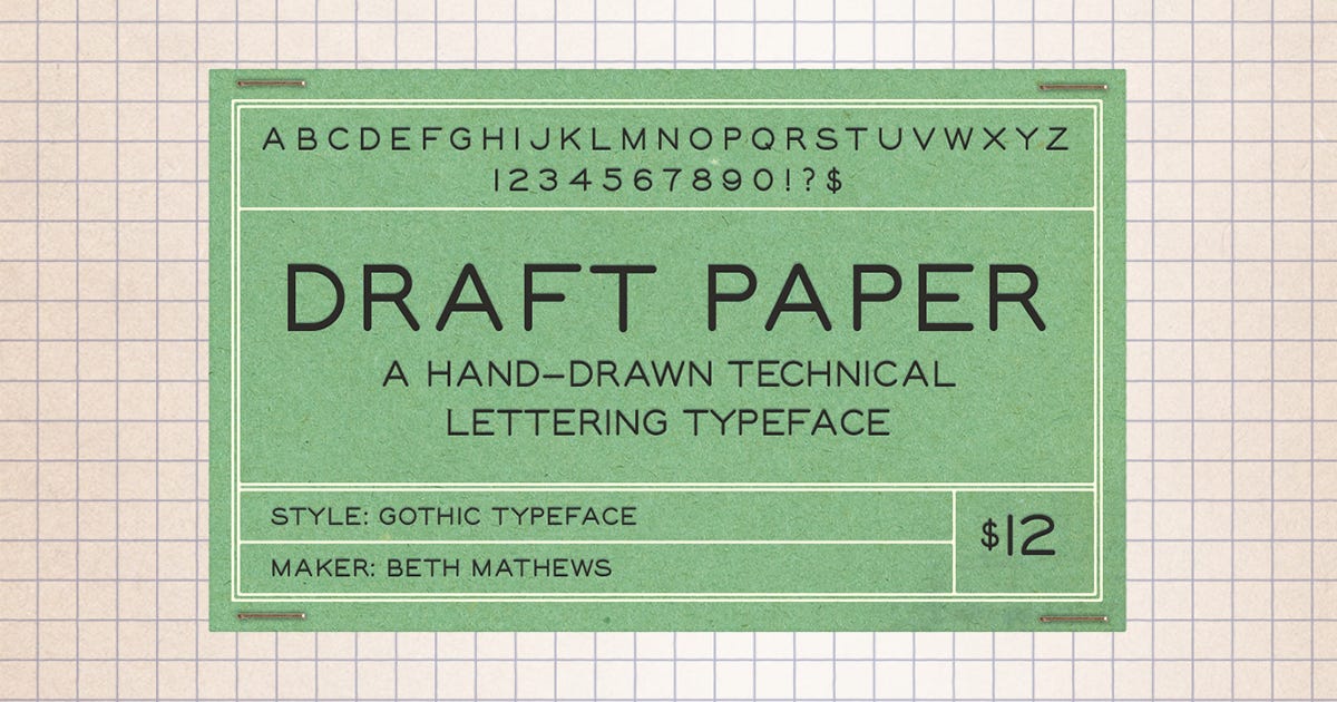
Introducing Draft Paper Typeface
A Hand Drawn Technical Lettering Typeface

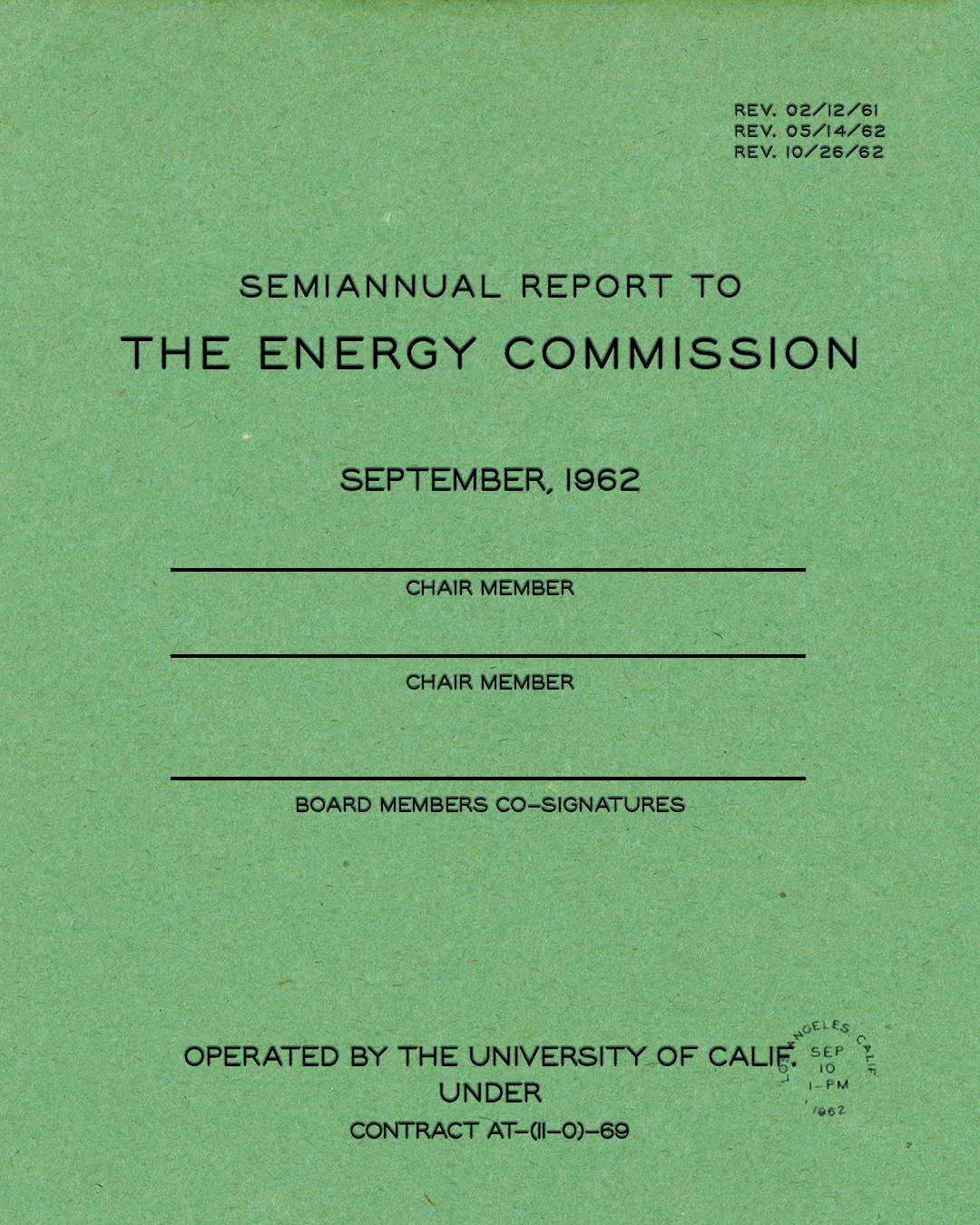
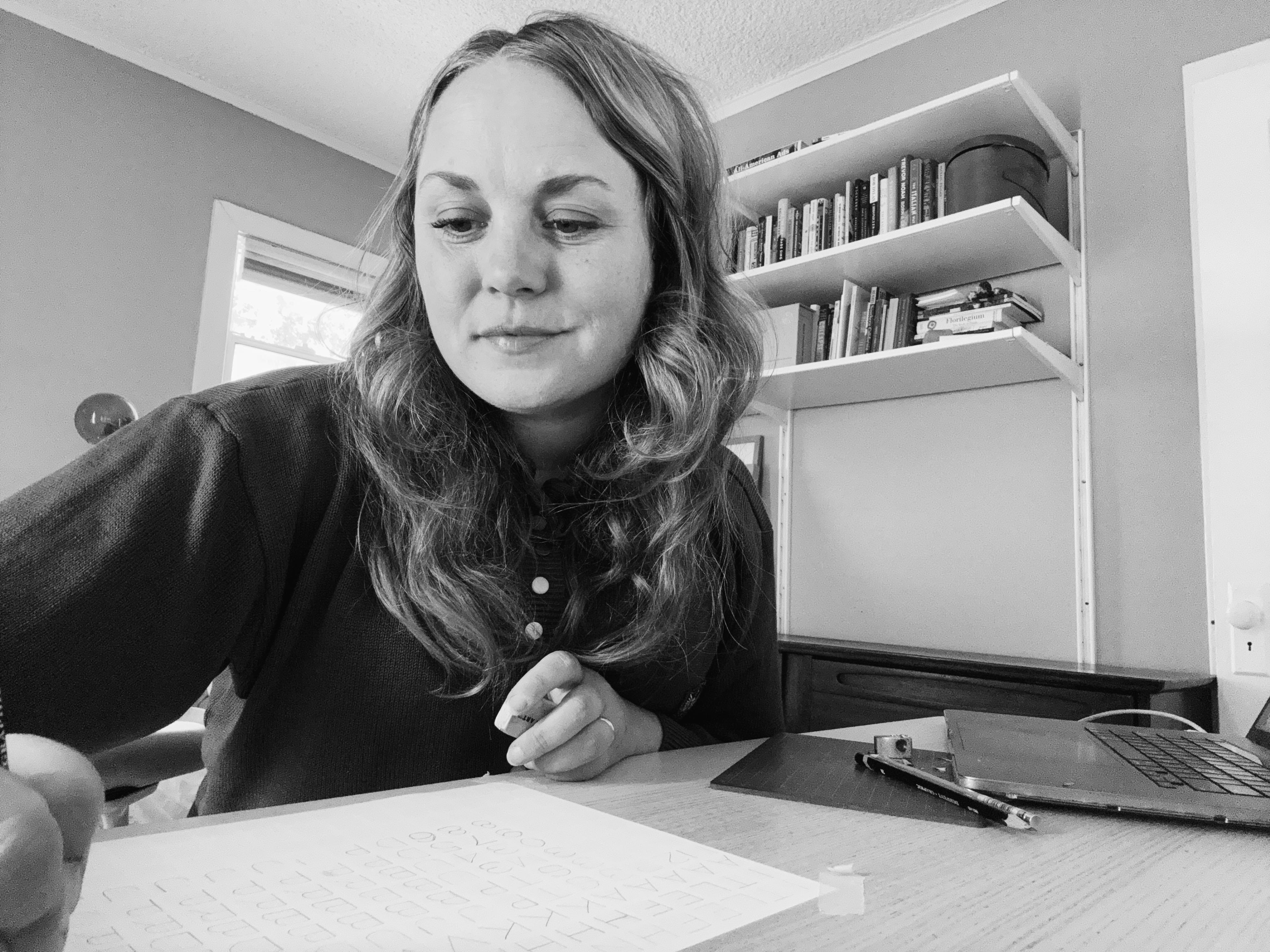
I’m currently working on a branding project that's led me down the lovely rabbit hole of mechanical and engineering manuals and vintage blueprints. The further I went down the hole, the more curious I became about why these pieces all had the same perfect handwriting in their charts and graphs. Turns out, technical illustrators, engineers, and draftsmen studied the “single-stroke Gothic alphabet” and practiced it over and over until they got it just right. So, for my monthly design prompt, I proposed learning how to actually do this handwriting and found several guides from the past to help us practice the single-stroke Gothic alphabet. Out of this design exercise, I ended up creating a typeface called Draft Paper!
I’m excited to infuse this typeface into my own work, as I find myself working on projects that need authentic-looking “blueprint” type details, such as dates, small captions, sub-headers, and fineprint packaging information for manufacturing and ingredients.
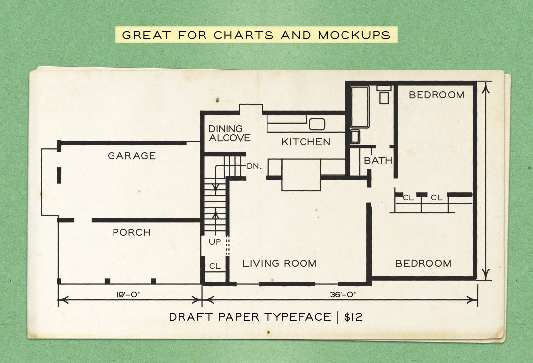
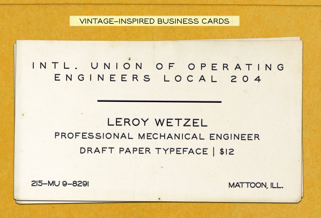
Here are some examples of how I plan to use it:
Charts, Graphs, and Information Bits and Bobs
Vintage-Inspired Business and Information Cards
Scientific Research Inspired Designs
If you happen to purchase this new typeface, I’d love to see how you use it in your own work! You can always send me a message here on Substack or reply to this email. Have a wonderful rest of your week!
Love,
Beth
If you enjoyed this post, you may enjoy these as well!
This is genius. I’m definitely buying it cause I could use it but also to support such a a cool project.
Wow this is supercool. So many hours spent "lettering"...